Are you tired of waiting forever for your Opi nail polish to dry? Well, you’re in luck!
In this article, we will explore the factors that affect the drying time of Opi nail polish. We’ll also dive into the chemistry behind it and give you some helpful tips to speed up the process.
Say goodbye to smudged nails and hello to quick-drying perfection!
Key Takeaways
- The thickness of the nail polish layer affects drying time, with thin coats drying faster and thick coats taking longer to dry.
- The temperature of the environment also plays a role, with higher temperatures speeding up drying and colder temperatures slowing it down.
- The humidity level in the air can extend drying time, while lower humidity helps polish dry quicker.
- Using warm air or dryers, such as a dehumidifier or fan, can expedite the drying process.
Factors Affecting Opi Nail Polish Drying Time
You can control the Opi nail polish drying time by considering certain factors.
One of the key factors is the thickness of the nail polish layer. If you apply a thin coat, it will dry much faster compared to a thick coat. So, if you’re in a hurry and want your nails to dry quickly, opt for a thin layer of polish.
Another factor to consider is the temperature of the environment. Higher temperatures can help speed up the drying process, while colder temperatures can slow it down. If you’re impatient and want your nails to dry faster, find a warm spot or use a dryer with warm air to accelerate the process.
Humidity level in the air can affect the drying time. Lower humidity levels can help the polish dry quicker, whereas higher humidity levels can extend the drying time. If you’re in a humid environment, try using a dehumidifier or a fan to reduce the moisture in the air and expedite the drying process.
Understanding the Chemistry of Opi Nail Polish Drying
To understand the chemistry of Opi nail polish drying, it is important to know how the ingredients interact and the role they play in the drying process. Opi nail polishes contain a combination of solvents, film formers, resins, plasticizers, and pigments. Each ingredient contributes to the overall formulation and affects the drying time.
| Ingredient | Role in Drying Process | Examples |
|---|---|---|
| Solvents | Evaporate to allow the polish to dry | Ethyl acetate, butyl acetate, and isopropyl alcohol |
| Film formers | Create a smooth and durable film on the nails | Nitrocellulose, polyurethane, and acrylic polymers |
| Resins | Improve adhesion and enhance durability | Tosylamide/formaldehyde resin, epoxy resin, and polyester resin |
| Plasticizers | Add flexibility and prevent cracking | Dibutyl phthalate, camphor, and adipic acid/neopentyl glycol/trimellitic anhydride copolymer |
| Pigments | Provide color and opacity | Iron oxides, titanium dioxide, and mica |
Understanding the interaction between these ingredients allows us to comprehend the drying process. When you apply Opi nail polish, the solvents begin to evaporate, allowing the film formers, resins, and plasticizers to bond and form a solid film on your nails. This film provides the desired color and durability. The pigments, present in the formulation, contribute to the opaque appearance of the polish.
Tips for Speeding Up Opi Nail Polish Drying Time
If you’re looking to speed up the drying time of your Opi nail polish, try using these helpful tips:
Make sure your nails are clean and dry before applying the polish. Any moisture or oil on your nails can hinder the drying process. Use a nail primer or base coat to create a smooth surface for the polish to adhere to. This will help the polish dry faster and last longer.
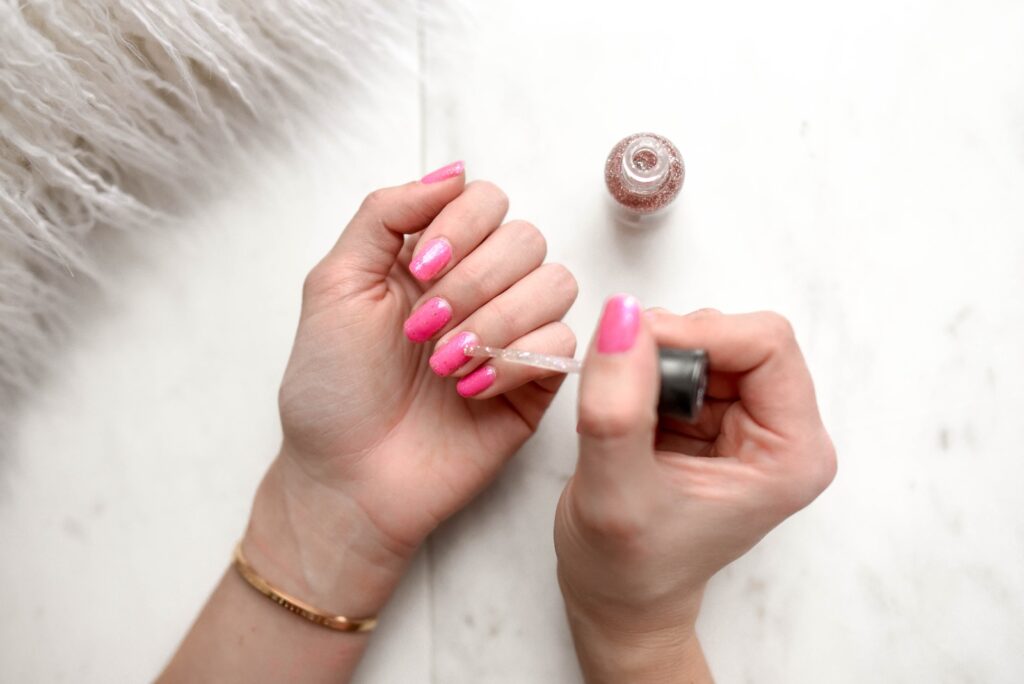
Apply thin coats of nail polish instead of thick ones. Thick coats take longer to dry and are more prone to smudging and chipping.
Allow each coat to dry completely before applying the next one. This will help speed up the overall drying time.
Invest in a quick-drying top coat:
Use a quick-drying top coat specifically designed to speed up the drying process. These top coats contain ingredients that help the polish dry faster without compromising its shine or durability.
Avoid heat and humidity:
Keep your nails away from direct heat sources, such as hairdryers or heaters, as they can cause the polish to bubble or crack.
Avoid humid environments, as high humidity can prolong the drying time of nail polish.
How to Properly Apply Opi Nail Polish for Optimal Drying
For optimal drying, apply Opi nail polish in thin, even coats and allow each coat to dry completely before moving on. This will ensure that your nail polish dries quickly and lasts longer. Here are some tips to help you properly apply Opi nail polish:
- Start with clean, dry nails: Make sure your nails are free from any oils or residue. Use a nail polish remover to clean your nails before applying the polish.
- Use a base coat: Applying a base coat before the nail polish helps to create a smooth surface and prevents staining of the nails.
- Apply thin coats: Instead of applying one thick coat of nail polish, apply two to three thin coats. This allows each coat to dry faster and ensures a more even application.
- Allow each coat to dry: Patience is key when it comes to drying nail polish. Allow each coat to dry completely before applying the next one. This will prevent smudging and ensure a long-lasting manicure.
Here’s a quick reference table to summarize the proper application process:
| Step | Instructions |
|---|---|
| 1 | Clean and dry your nails |
| 2 | Apply a base coat |
| 3 | Apply thin coats of polish |
| 4 | Allow each coat to dry |
Common Mistakes That Extend Opi Nail Polish Drying Time
Avoid rushing and applying too many layers of Opi nail polish, as this can extend your drying time. When it comes to achieving quick-drying nails, it’s important to be patient and avoid these common mistakes:
- Applying thick coats: While it might seem like a time-saver to apply one thick coat of nail polish, it actually takes longer to dry. Thin, even coats are the way to go. Not only will they dry faster, but they’ll also give you a smoother and more professional-looking finish.
- Skipping the base coat: Don’t underestimate the importance of a base coat. It not only helps the polish adhere better to your nails but also protects them from staining. By skipping this step, you risk prolonging the drying time of your Opi nail polish.
To avoid extending your drying time, make sure to:
- Allow proper drying time between layers: Rushing to apply the next layer before the previous one has fully dried is a recipe for disaster. Take a few minutes to let each coat dry completely. This will prevent smudging and ensure a quicker overall drying time.
- Avoid excessive shaking of the bottle: While shaking the bottle may seem like a good way to mix the polish, it can introduce air bubbles, leading to longer drying time. Instead, roll the bottle between your palms to gently mix the polish.
Comparing Opi Nail Polish Drying Time With Other Brands
Compare the drying time of Opi nail polish with other brands to determine which one dries the fastest.
When it comes to your freedom and time, you want a nail polish that dries quickly. After all, who’s the patience to sit around and wait for their nails to dry?
Opi nail polish is known for its quality and durability, but how does it compare to other brands in terms of drying time?
One popular brand that’s often compared to Opi is Essie. Essie nail polish is loved by many for its wide range of colors and long-lasting formula. However, when it comes to drying time, Opi takes the lead. Opi nail polish dries faster than Essie, allowing you to get on with your day without worrying about smudging or chipping your freshly painted nails.
Another brand that’s worth mentioning is Sally Hansen. Sally Hansen nail polish is known for its affordable price and wide availability. While it may be a budget-friendly option, it falls short in terms of drying time when compared to Opi. Opi nail polish dries much faster than Sally Hansen, giving you the freedom to continue with your daily activities without the fear of ruining your manicure.
Conclusion
In conclusion, understanding the factors that affect Opi nail polish drying time is essential for achieving optimal results.
By applying the polish properly, avoiding common mistakes, and following helpful tips, you can speed up the drying process and enjoy beautiful, long-lasting nails.
While Opi nail polish may have a slightly longer drying time compared to other brands, the end result is worth the wait.