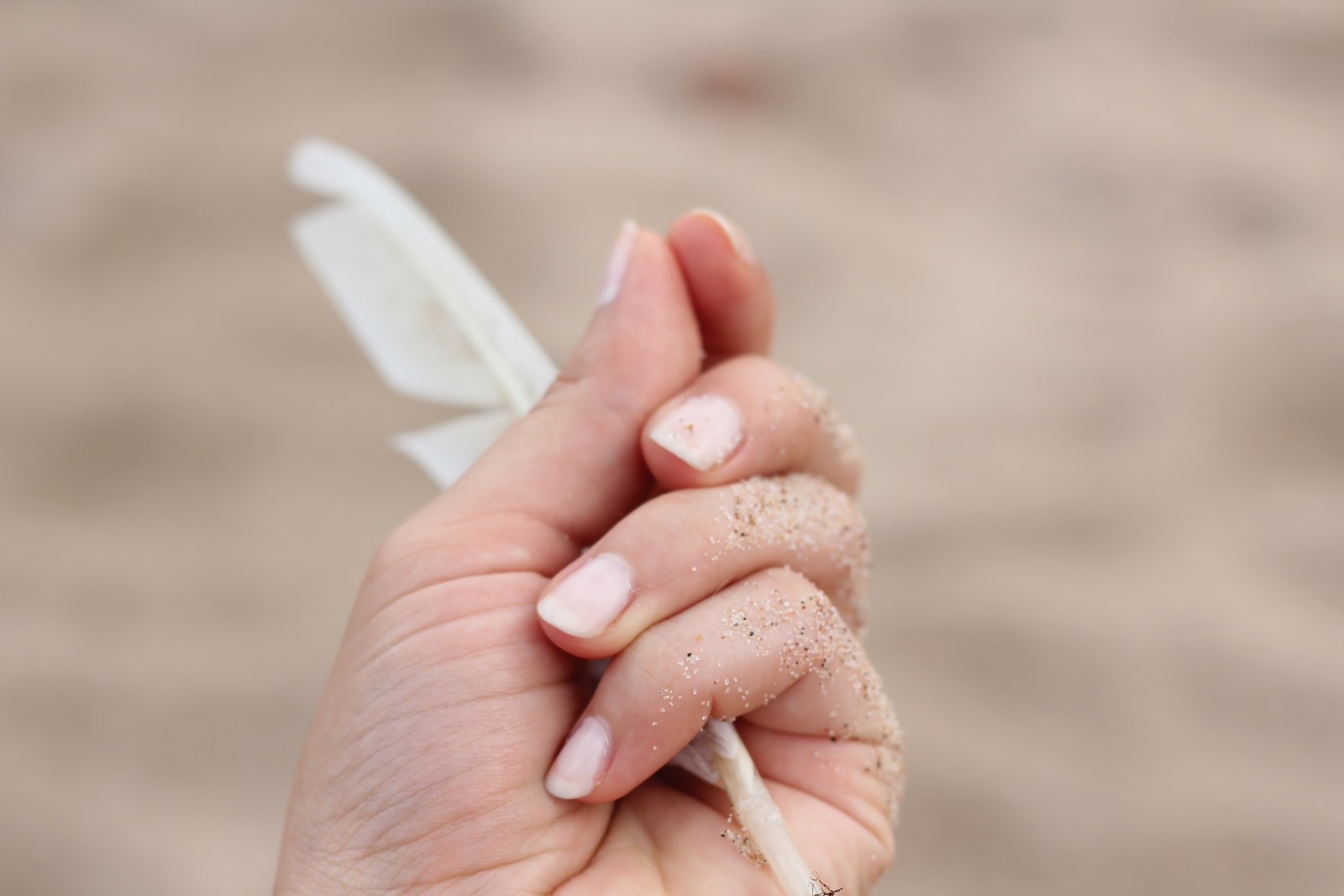
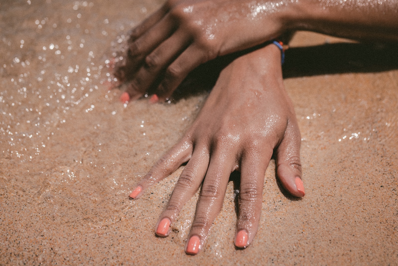
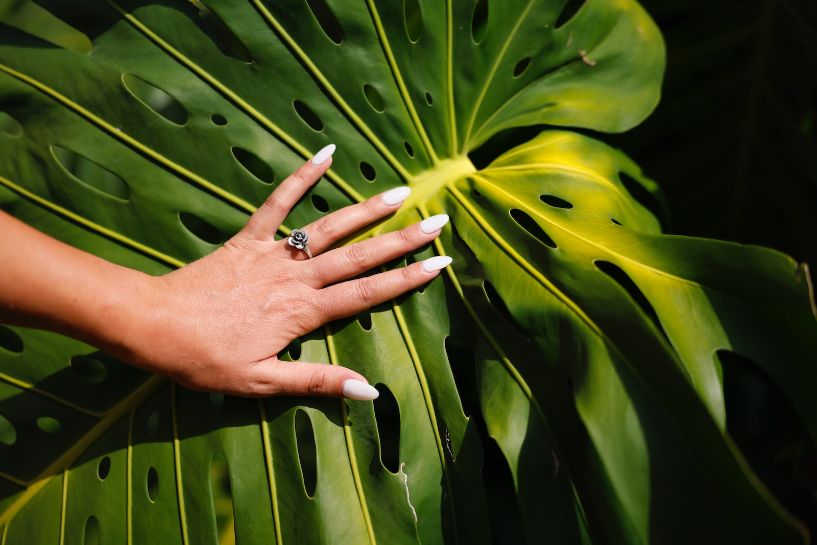
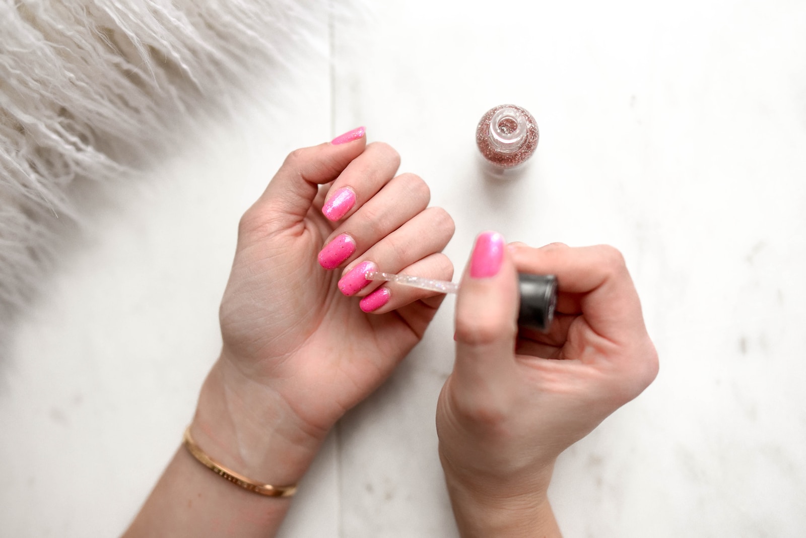
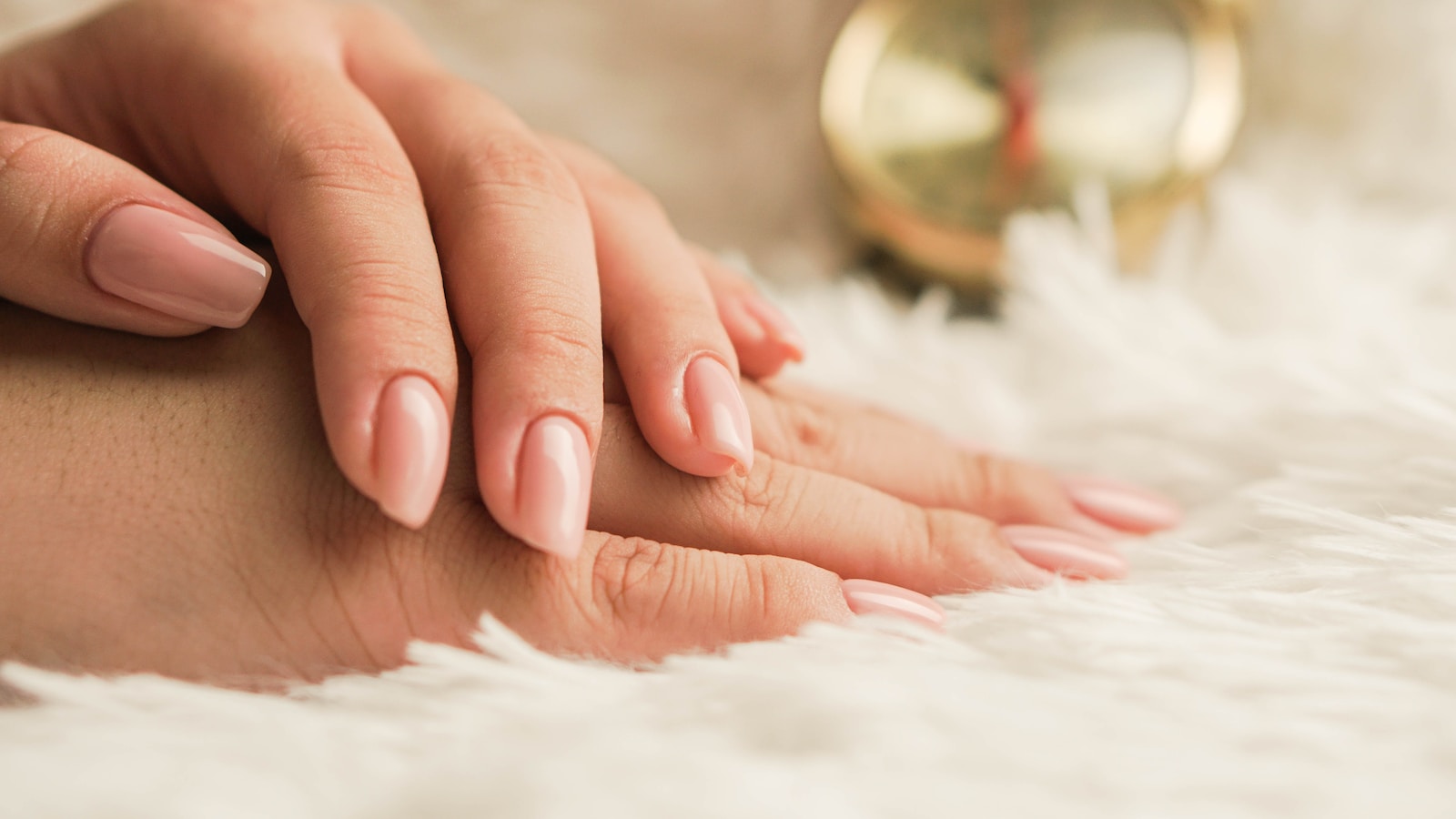
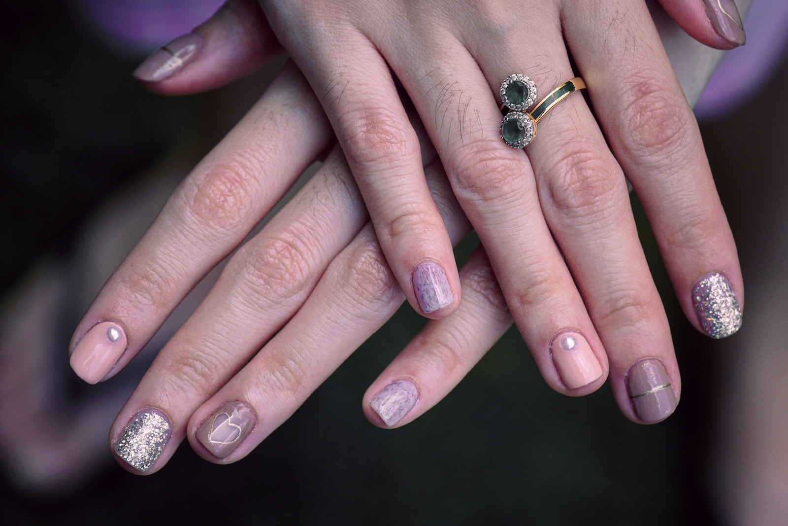
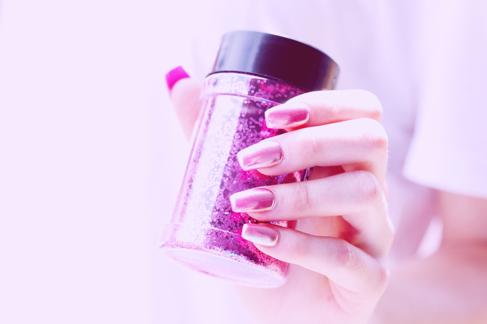
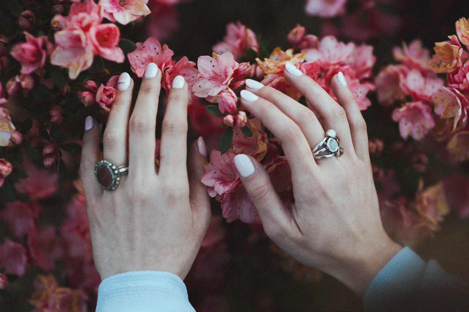
Experiments in Layering: Hits Phenomena Moonbow + Essie Grape Crush

May 14th, 2013

I started writing this post during that week that my site went on the fritz. I gave up after I banged my head against my computer and had to go outside to burn a WordPress effigy. Last week, I finally figured out what caused the issue in the first place. As it turns out my website does not like the WordPress Jetpack Plug-in. I deactivated it, along with everything else, when I was trying to fix the problem originally. It didn’t help instantly, but after being deactivated for a couple of days, I logged back in to find that everything was working perfectly. Fast forward to a few days ago, I tried to check my stats and I realized that that function is dependent on Jetpack so I reactivated the plug-in. Instantly, the site stopped working again and it took about 24 hours after deactivation for the site to function normally. At the very least, I finally know what happened but I’m flying completely blind in terms of site stats. Haha.

In any case, back to the post, I got an email recently from a newly minted nail polish collector who was interested in layering techniques. I don’t layer often because my nail polish OCD compels me to wear a color in its unaltered form the first time I wear it. But when I do layer, I love it. And some colors scream “layer me!” despite my obsessive tendencies.

Hits Moonbow

Hits Moonbow, from the Phenomena collection, is precisely that type of color. This polish is ridiculous. Just ridiculous. It’s a color-shifting multichrone glitter suspended in a cloudy base.  The glitter shifts from green and fuchsia to purple and occasionally it flashes gold. When I first saw photos of this color I was instantly obsessed, I had to have it, stat! However, from the swatches I saw, it didn’t look like a glitter polish, it looked like… well… magic. So I was a little disappointed when I received it and discovered that while it was still quite magical, it didn’t really look the way it looked online. (This is the second time this has happened recently *makes Mikayla is not impressed face*). My next hope was that it would be a buildable glitter, meaning the whole surface of the nail would be completely covered within a few coats. It is buildable, sort of. The glitter will cover the surface of your nail but it takes about 4 coats. That would be fine, except that, for whatever reason, the glitter does not coat the tip of the nail very well. The end result looks a bit like tip pull. You can definitely see what I’m talking about in the photo above – needless to say, it’s not very flattering.

Hits Moonbow Top View

Because of that issue, I don’t recommend wearing this color on its own. It is gorgeous for sure and it definitely has a crash-inducing-stare-at-my-nails-while-driving quality to it but it looks infinitely better layered over another color.

Hits Moonbow over Essie Grape Crush

Case in point, Hits Moonbow over oldschool Essie Grape Crush. Looks much better, right? Grape Crush, a sheer purple glaze, is from an older Essie collection that consisted of all sheer glazes (as opposed to more modern jellies). For reference and comparison Essie Cherry Pop, which is still widely available, is from the same collection and has the same look and consistency. The beloved Essie Night Cap is also from that collection. I somehow neglected to photograph Grape Crush on its own – bad nail blogger, bad. I’ll make that up to you, I do plan to post the whole collection soon. I’m only missing one more polish, Essie Apricot Fizz, to complete the set of 6 from the original collection! In any case, this NOTD is 3 coats of GC and 3 coats of Moonbow. I know, I know that’s too many coats. But I liked the end result and I didn’t have any drying issues after a coat of Seche.

Hits is a new brand to me. I’m a little biased because it hails from the mother country, Brazil. The Phenomena collection is my first experience with this brand and I was pretty wowed by it even though it wasn’t what I expected. There are a few more Hits polishes on my lemming list, including pretty much ALL OF THE HOLOS. My one gripe is that the bottle is pretty small so you end up with that noticeable, and uber distressing, dip in the bottle after just one mani. It gave me some serious angst, another aspect of my nail polish OCD, so I do plan to get a back up bottle.  These bad boys retail for approximately $6.50 to $7.00.

When I was on the hunt for Moonbow and company, all the e-tailers had it listed as out of stock. That day, I placed orders with both Llarowe and Ninja Polish for several other colors. I included a note in the comments section of my order for both e-tailers that I really needed this color and asked that if they happened to have a bottle laying around in the stock room to please add it to my order and charge me for it. Ninja Polish did just that (excellent customer service on their part), meanwhile Llarowe very kindly included a bottle of it in my order without charging me. Even though I do want a back up bottle of this color and I was very grateful, I felt badly because I like to support small nail polish related businesses whenever I can. I figured that the best way to repay that kindness was to gift the bottle that I bought to another blogger and keep the gifted bottle. I did that in hopes of spreading the awesome around because more swatches = a better world, right? In any case, I don’t say this often but I highly recommend both e-tailers. They are both great so you can’t go wrong with either one. 

 Thoughts on Hits or Moonbow? What about nail polish OCD? Do you have it? If yes, how does it manifest for you?

PinterestEmailShare

Rescue Beauty Lounge Emoting Me Collection 2013 Part 2

May 8th, 2013

And now for the second set of colors from the Rescue Beauty Lounge Emoting Me Collection (Nearly two weeks later!! Sorry!!!)

Rescue Beauty Lounge Thank You

Rescue Beauty Lounge Thank You is a very light, muted nude toned pink with very subtle fuchsia shimmer. The shimmer creates a somewhat frosty effect. This color is very delicate with a hint of glimmer, perfect for conservative work places. The application, like some of the other colors in this collection was a bit on the thick side. This swatch is 3 coats.


Rescue Beauty Lounge Become One

Rescue Beauty Lounge Become One is a leafy yellow toned green creme. It is my absolute favorite color from this collection. This color fills me with feelings of happiness and nostalgia. It reminds me of childhood, of beautiful colorful leaves, of crayons, of Luigi! This photo is a little bit inaccurate, it’s a little more yellow-toned in real life. The application was good, very smooth but it did get thicker with each coat. It’s definitely a stainer though, so double-up on base-coat.

Rescue Beauty Lounge Pause

Rescue Beauty Lounge Pause is a very pigmented, vibrant mid-toned violet with subtle purple and blue shimmer. I feel like I can’t fully appreciate this color because of my purple-hatred. As far as application, like the others, it is also a bit thick. This is 3 coats.

Rescue Beauty Lounge Smile

Rescue Beauty Lounge Smile is a gorgeous, vivid mango pink with subtle fine gold shimmer. This one was not thick like the others and applied very well. This is 3 coats. I want to say I’m usually not moved by colors like this but who am I kidding? I’m such a sucker for these red/pink/coral/orange chameleons even though I hardly ever wear them.

 Bah. I’ve been going through an abnormally excessive amount of stress lately. So much so that I’ve been getting physically sick as a result. In an effort to take the edge off, I’ve taken up a few new hobbies. While I love nail polish collecting, it isn’t as relaxing as it used to be… probably because I still feel like I’m catching up. I’ve been trying out vegetable gardening for the first time, quite successfully might I add. *toot my own horn* I’m really enjoying it so far because it’s something that I get to do with DH and it’s just about the coolest thing ever to watch plants grow. Not to be a total cheese-ball but it’s pretty fulfilling. I’ve also taken up an old hobby, compulsively checking out and hoarding library books (obvi with good intentions of actually reading them) haha. I’m also trying to do my nails with more frequency. In the long, long ago when I had all the time in the world, I did my nails every day. Every. Day. Crazy, I know. Now I’m lucky if I get to do them more than twice a week. Although I do love my new unwinding techniques, nothing beats a shiny, glossy new mani in a great color.

Do you guys have any hobbies other than nail polish? How do you relax and unwind?

___________________

Disclaimer: This collection was sent to me for review by Rescue Beauty Lounge.

PinterestEmailShare

Rescue Beauty Lounge Emoting Me Collection 2013 Part 1

April 28th, 2013

After a couple of days of fiddling with no success and getting shot down by my brother and a computer tech (both told me nothing could be done to fix the blog problem), I logged in one more time to fiddle some more and suddenly the problem was gone! I still don’t know what happened and hopefully it won’t happen again… but for now, the blog is functioning, finally. I’m just happy to be up and running again. I feel so relieved!

The Emoting Me Collection is the newest installation in the Rescue Beauty Lounge library of colors. The theme here is self-awareness, introspection, self-appreciation, and reflection – this meaningful message appeals to me, especially right now. I’m hard on myself and when things get rough, be it at work or at home, I have a tendency to engage in a lot of wallowing as a result. Wearing these colors has been a small reminder to take it easy (and if ever there were a week for that type of reminder, this was it).

Color-wise, this collection is a well-balanced mixture of moody work appropriate colors and bright, exciting colors. My one gripe is that there are only two true cremes. Granted, the two are really great, but it’s only two none-the-less. You guys know me, I’m a creme girl. With that said though, I really do love these colors so I’ve been actually wearing them instead of just swatching which is why I’m only showing you half of the collection in this post. Tonight’s mani will be either Become One or Thank You – I haven’t been able to decide yet.

Rescue Beauty Lounge Be Humble

Rescue Beauty Lounge Be Humble is tough to describe. It’s a mushroomy, light grey putty with a purple/pink undertone and with subtle blue and violet shimmer. The shimmer ends up being nearly invisible – the over-all effect is sort of a snowy “interference” on the surface of the nail that gives the color depth. This is a chic, professional color. Definitely, me gusta. Be Humble dries slightly darker on the nail than it looks in the bottle color. The application was good but a smidge on the thick side. This mani was 3 coats.

Rescue Beauty Lounge Forgiveness

Rescue Beauty Lounge Forgiveness is a greyed-out, dusty lilac creme. Moody… work appropriate… right up my alley. If you have trouble wearing lilacs like I do – this might be a good color to pick up. It didn’t wash me out and was not just wearable (usually the best I can hope for with shades like this), but actually affirmatively flattering. This NOTD was 3 coats, like Be Humble – a little thick but not terrible.

Rescue Beauty Lounge Turn It Around

And, finally, Rescue Beauty Lounge Turn It Around a dark olive green speckled with course copper shimmer. I think my Husband summed it up best, ”Whoa… that’s a cool color.” Yea, I completely agree. I don’t own Rescue Beauty Lounge Halcyon (waaaaaaaah) but I imagine that Turn It Around is a distant cousin. The application was good but a little thicker than the others – probably as a result of copper specks. This is 4 coats – but it would have been good at 3.

What do you think of the Emoting Me Collection? Hoping to pick up any?

 __________

Disclaimer: This collection was sent to me for review by Rescue Beauty Lounge. (Sorry! I forgot to include the disclaimer when I first posted this!)

PinterestEmailShare

Technical Difficulties…

April 17th, 2013

If you follow me on twitter you already know about this but it looks like this may take some time to fix so I wanted to make sure everyone knows what’s going on. About two weeks ago, I noticed my admin panel was very slow, so slow that nothing would load. I didn’t think much of it and just gave up on posting for the night. After that, I didn’t get a chance to try to post again because I ran into a busy period at work and then took a mini-vacation. This past Monday, I tried to post again only to find that the same problem I had before was still occurring. Nothing loads. I can’t get to the “new post” page. When I can get to it, it won’t load photos (even for this post, I wanted to post a funny “technical difficulties” meme photo and couldn’t). When I’m lucky enough to get a photo loaded, everything gets deleted when I try to save the draft or publish. VampyVarnish suggested that my site may have fallen victim to an attack on WordPress. I spent about an hour on the phone with my hosting provider and on different forums to find a solution, all to no avail. I de-activated some plug-ins which made this post possible using QuickPress but it’s impossible to do any real blogging right now. I’m not sure what’s going on yet but it’s clear that I’m going to have to roll up my sleeves and do a lot of work on this. (I might even have to pull out the big guns – my little brother, programming extraordinaire!) I have a rough work week coming up, so I might not be able to sit down and fiddle with WordPress until this weekend.

I’m so bummed and so, so sorry about this. I have so many new collections to show you. So many pretty photos. T_T

I’m planning to re-install WordPress, etc., but if you have any other suggestions – please let me know!! And thank you for sticking with me!

<3

PinterestEmailShare

Gasp: A Few A England Holos

March 22nd, 2013

I was back to blogging for about two seconds before this bomb was dropped on me: Holos – there’s a ton of them out there now and… they come in green. Having reached the peak of my nail polish collecting in 2009, this was practically unheard of for me. My first encounter with this unicorn, the green holo, was the glorious Glitter Gal Lizard Belly. It wasn’t too long before everyone told me about A England and the mantra was ”you need all of these, right now.” I was lemming about three-quarters of their line, particularly their holos. With that said, I’ve had these for months but it took me forever to photograph them because I didn’t want to just swatch them. I loved them so much I really wanted to actually wear them. And, sadly, although I have a lot more nail liberty now than I did before, I still can’t go balls to the wall all the time so getting this post together took a hot minute.

A England Dragon

A England Dragon *deep breath*  a sage green holo. The holo in these polishes is pretty subtle, definitely not blingtastic at all. In my opinion, the holo is neither linear nor scattered – a better description would be “ambient,” like a shimmery interference. Application was good but the formula was a smidge on the thick side, perfect at two coats but I did three. Dragon is my favorite of the three polishes featured in this post because this shade of green was very flattering to my skin-tone.

A England Saint George

A England Saint George is a teal leaning dark green holo. *swoon* Like Dragon, the holo is fine grained. This was my New Year’s Eve NOTD! Application was comparable to Dragon – this is three coats, but it would have been fine at two. It’s a bit of a stainer, so beware of sloppy application. Please excuse my gross flairy ring-finger nail. This photo was taken when I was struggling with peelies a few months back. My nails tend to flair like that when they’re weak. Taking biotin and switching back to my old holy grail base-coat that was unfortunately discontinued before its time, Sally Hansen Nail Quencher, really helped with the terrible peeling. My failed attempts to find a new go-to base-coat will be the topic of many anguished posts to come.

A England Lady of the Lake

Last but not least, A England Lady of the Lake, a dark grape ambient holo. This shade is consistent with Dragon and Saint George in terms of look and application. This is my current NOTD. As you can see I had to nubbinize so I used that as an excuse to holo-it-up - looooooove it. Generally, I have a love\hate relationship with purples. I feel like purple is so over done: the “red” of “wacky” colors, if that makes sense. But, like with red, I’m a hater until I actually wear a purple polish, then I remember why everyone loves the color so much. It’s just gorgeous. Not to keep making excuses for my sub-par nail situation but please also excuse this photo. Since the past few weeks were so rough, I fell off the wagon in terms of keeping up with my moisture regime - these cuticles are the sad, sad result. womp womp.

This was my first foray into A England and I’m hooked. A England is the brain child of Adina, an evil nail polish genius. (You can follow her on twitter @aenglandtweets). I feel like if we knew each other in real life we’d be total besties… a love for nail polish, legends & myths, a gothic aesthetic, and a touch of anglophilia … um, sign me up for that life long friendship. A England is an indie brand and hails from the United Kingdom. [edited - thank you Chia & Aglaya for catching that for me] Although A England used to ship to the U.S. they are no longer able to ship internationally. However, you can get them from U.S. retailers like Ninja Polish and Llarowe for $10. You can get additional information about where to buy A England here.

Have you tried A England? What do you think?

_______

Disclosure: These were sent to me for review by A England.

PinterestEmailShare

Learning a Lesson: Oscar de la Renta Larimar

March 20th, 2013

Some of you may remember my wedding post from a couple of months back – I mentioned a nail polish shown in a runway photo from Oscar de la Renta’s Spring 2013 Bridal Collection that sparked my interest in having blue nails at my wedding. For reference, here’s the photo I was talking about:

182888434837973990_YBn5ElSa_f

(Photo Credit: Society Bride)

At the time, I didn’t realize that this was a real color – I figured it was some frankened combo made by some genius nail tech especially for this runway shoot. A few months after my wedding a friend from the nail community alerted me to Larimar, a color being sold on Oscar de la Renta’s website for $22. My eyes popped out of my head – there it was… the color I was looking for… that truly beautiful ethereal, seemingly surreal blue from the runway show!! I died a little and after my resurrection I forked over the 22 bucks to snag myself a bottle.

Oscar de la Renta Larimar

Oscar de la Renta Larimar is the truest light blue creme I have ever seen. My photo is a little inaccurate, it’s a smidge lighter in real life. All the light blues in my collection, for example China Glaze Moody Blue and Rescue Beauty Lounge Bikini Bottom, seem to lean green in comparison. I really love the color but the polish was a bit of a disappointment. First, while the runway photos were color accurate, that seemingly translucent, backlit quality exhibited in the photos (that, frankly, made this polish look so special) did not translate to my mani. I don’t know whether that should be attributed to the number of coats I used - I failed to write it down in my notes but I believe it was around 4. Second, this is a PITA to apply. Somewhat thick but thin at the same time – I ended up using the slather and sculpt method (slathering it on willy-nilly, then very carefully cleaning up afterwards). The bottle and brush shape did not help the PITA-ness at all. The bottle is longer than an average nail polish bottle, as a result the brush was very long. If you do your nails often and you’re used to a standard bottle size, you’re probably also used to judging the amount of polish you need in relation to how the polish flows down the brush shaft. For me, judging the polish stream on the brush is an unconscious, automatic action – with this longer brush, more polish than normal flows or drips downward on the brush causing unexpected pooling. That took some getting used to, for sure.

This polish presented an interesting conundrum for me. As a polish blogger, I’m often explaining to people that photos won’t always be accurate. There’s so much that goes into how a color in a photo looks – just to name a few factors, the lighting, the skintone of the model, the camera, and the computer monitor being used to see the photo will all effect how the polish color appears. When I first started blogging again, I went to a photography store to buy a new lighting system because I had long ago chucked my old DIY light box. I tried to explain to the owner of the store what this site is about - he was a career products photographer so he was definitely the right person to talk to about nail polish photo color accuracy. He pretty much told me flat-out, ”you will never get the color in the photo to look exactly how you see it in real life.” I really do make a conscious effort to ensure that my photos are as accurate as possible. I don’t use editing software for color correcting, because, well, I’m bad at it – I only make it worse. So, when accuracy is not possible, I try to make sure that I tell you about it. I know a lot of people get really frustrated when they see a photo of a color on a site, order it thinking that they are getting the color that they saw, only to find the color in real life looks nothing like it looks on the site. I can honestly say that I’ve never felt that way until I got this color. Since I started collecting, I’ve always looked at swatches online before making a purchase. In doing so, I’ve always expected there to be some level of inaccuracy associated with the photos. I was never disappointed when a color ended up being different then a swatch I’d seen… until this color. I guess it’s because there aren’t many colors I come across that seem really unique. This color, in the runway photos, seemed really special – I was expecting a crelly with an inner luminescence, only to get a standard crème. Now been that I’ve in the shoes of a frustrated swatch viewer, I totally understand why peeps complain about that.

With all that said – is this color worth it? Hefty price tag, color inaccuracies, application issues and all? The surprising answer is yes. It’s not what I expected and that was disappointing but I couldn’t find anything in my stash quite like it. And it’s seriously pretty. Totally would have worn this to my wedding if I had owned it at the time (even over my Mother’s objections).

What are your thoughts on color inaccuracies? Is it a pet-peeve or do you leave room for error?

PinterestEmailShare